Text codes and sizes
These are the standard sizes for the H codes. You can put text between H1 to H6 like this example:
<h5>H5 Text</h5> which automatically will result in
H5 Text
Not only will they assume the right size but they also automatically resize depending on the screen width (pc, tablet, phone)
This makes adding/editing simpler and consistent use of fonts and font size throughout the site.
H1 Text
H2 Text
H3 Text
H4 Text
H5 Text
H6 Text
Body text, 16 pixels. This is the main tekst. This is the Roboto Font and a lighter color.
Superscript and Subscript
With the codes sup and sub (start with <sub> and end with </sub> ) you get super- and subscript. Example:
m<sup>3</sup> results in m3
h<sub>2</sub>o results in h2o
This is also possible in the Ninja Tables
Colors
Beige #afa599
Grey #828889
Dark Grey #232628
Green #00b050
Dark Green #004a11
Library Blocks
The Divi theme allows you for having ready made “blocks”. That way you can re-use blocks that you use regularly.
You can recognize them by the bright green borders.
2 Things are important to notice:
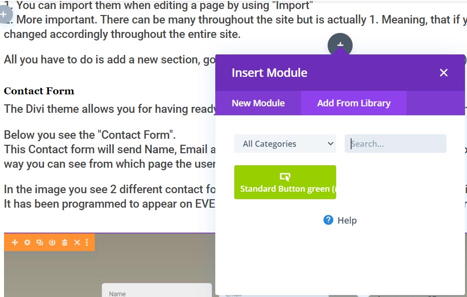
1. You can import them when editing a page by using “Import”
2. More important. There can be many throughout the site but is actually 1. Meaning, that if you change it on one page, it will be changed accordingly throughout the entire site.
All you have to do is add a new section, got to “import” and choose the block you want to (re)use

When you Click on the + to add a new section, row or module, you see this. Choose “Add From Library” and the ready made blocks will show up.
Contact Form
The Divi theme allows you for having ready made “blocks”. That way you can re-use blocks that you use regularly.
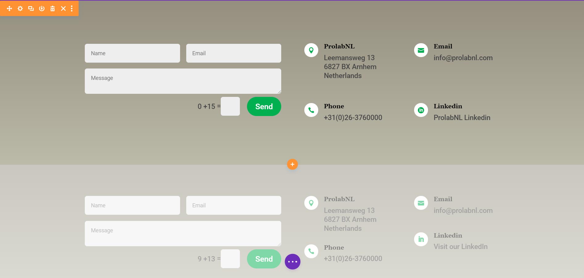
Below you see the “Contact Form”.
This Contact form will send Name, Email and Message but the message you receive will also contain the page name and URL. That way you can see from which page the user has sent the contact form.
In the image you see 2 different contact forms. 1 For PC and Tablet and below that (slightly lighter) the Phoen version.
It has been programmed to appear on EVERY page. Just create a new page and it will be there.

Standard Button
Below you see the “Standard Green Button”. All you have to do is when adding module, got to “import” and choose
“Standard Button green (rounded) “.
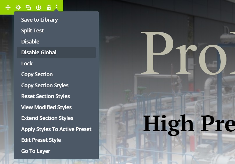
This will place a green button with all styling ready made. It is left aligned. Don’t forget to first “Disable from Global” and than fill in the Link for this particular button.

Sub Page Header
Below you see the “Sub Page Header”. Go to “import” and choose
“Standard Header sub-pages”.

This again is a libray block (light green borders). If you change contet in it, it will change throughout the site. To disable that, first you have to “Disble from Global”. That makes it a stand alone block. Changes made will NOT be throughout the site.
Click on the gear wheel and select “Disable from Global” You will see the borders loose their light green color.

Services Section
Below you see the “Services Block”. Go to “import” and choose
“Standard Service Section (on front-page)”.
Don’t forget to first: Disable from Global
